How I read the water.
Before anything gets built, I map the terrain: market, competitors, the actual humans who'll use the thing. Deciding which wave to let pass is most of the job.
Choosing the MVP platform
Self Check-In is bootstrapped, and I had one goal for the MVP: get a real person through a real experience within 90 days to test whether the core idea (an emotionally-guided itinerary that reveals itself progressively, like a food tour) actually created the feeling it promised. I wasn't trying to build the "right" product yet. I was trying to read the conditions correctly before committing any real engineering time.
| Website + PDF/Email | SMS/WhatsApp Chatbot | Lightweight Web App | |
|---|---|---|---|
| Time to launch | Fast | Fast | Slowest |
| Cost to build | Lowest | Low-moderate | Highest |
| User friction | Medium | Lowest | Highest |
| Ability to test core emotional flow | Weak | Strong | Strong, but overbuilt |
| Element of surprise / pacing | Weak: revealed all at once | Strong: unlocks in real time | Possible, but weaker |
| Personalization integrity | Weak: trivially forwardable, loses meaning out of context | Strong: tied to one phone/session | Moderate |
| Competitive differentiation | Weak: too close to existing players | Strong: format itself differentiates | Weak: crowded space |
| Behavioural fit | Moderate | Strong: phone already in hand | Weak: new habit required |
I ruled out the PDF first, for a reason that surprised me when I actually named it: it wasn't just low-friction UX-wise, it was structurally wrong for what I was building. Once it's a file, it can be forwarded to someone whose emotional state it wasn't built for; the profile-based personalization that makes the whole thing work collapses the moment it leaves the original context. SMS solved that, matched the progressive-reveal pacing I wanted, needed no new behaviour from the user, and let me build and test the exact mechanic I was most curious about, all without writing a line of app code. Reading the conditions here meant recognizing that the "leanest" option on paper (the PDF) was actually the wrong bet, because it failed on the dimension that mattered most.
Consolidating three merchant apps into one
I stepped into this role in the middle of real organizational flux, inheriting a stack that already had three separate apps: the original Ackroo app (simple, in-house, offered to every vertical from hospitality to petroleum), Simpli Connect's Custom App (bespoke builds outsourced to India, no repeatable process, no PM oversight), and Simpli Connect's Shared App (free, broken for anyone in more than one loyalty program, buried behind a confusing centralized app), plus a costly new fourth app already underway, positioned as a future marketplace. My job wasn't to pick the most exciting option. It was to actually read what each of these four paths was, what it cost, what it could become, and whether the newest, most invested-in one deserved to survive that scrutiny.
| New "Improved Shared" App (in-flight) | Simpli Custom App | Simpli Shared App | Original Ackroo App | |
|---|---|---|---|---|
| Technical foundation | New build on Firebase, unproven, mid-flight | Auth0, built one-off per merchant | Auth0, multi-tenant, broke for multi-program users | Auth0, simple, already proven at scale |
| Build/maintenance model | Major spend already committed, more needed to finish | Up to 8 months per app, outsourced to India, no repeatable process | Existing, but plagued with registration failures | Live, in-house, one mobile expert, 2-week turnaround |
| Cost & revenue model | Big spend, pitched as a future marketplace, unproven | High one-time fee per merchant, no recurring revenue | Free to merchants, no revenue at all | One-time setup fee only, but a foundation to build recurring SaaS on |
| Consistency & quality | One more unproven app to maintain | Wildly inconsistent, "unattractive," no PM involved | Generic, undifferentiated beyond a barcode scan | Consistent single codebase, easy to extend uniformly |
| Fit across verticals | Not yet built with verticals in mind | Custom per merchant, but not scalable | One-size-fits-all for hospitality, auto, and petro alike | Same limitation today, but simplest base to layer vertical features onto |
| Known reliability issues | Unknown: still being built | Nonstandard, no oversight | Registration failures, dependent on a confusing external app | Stable, if basic |
I killed the new project despite the money already spent on it, because due diligence showed it was solving the wrong problem: adding a fourth app to a stack that was already incoherent, when the real issue was that one identical experience was being forced onto merchants with completely different end-user needs. I chose to consolidate around the original Ackroo app specifically because its simplicity was an asset, not a limitation: it was the only foundation stable and standardized enough to build on without inheriting the India outsourcing dependency or the shared app's structural failures. That let us cut the outsourced contract entirely, run the rebuild with one dedicated in-house mobile director, and layer in features merchants would actually pay for (punch cards, vendor-linked promoted ads, self-serve profiles, food-ordering integrations) funded by converting to a recurring monthly SaaS fee instead of a one-time charge. Some free-tier customers who wouldn't pay for the improvement churned out, and that was the right trade: new merchant sign-up landed close to 100%, and net dollar retention actually improved, because we'd finally priced the product to cover what it cost to run instead of eating that cost indefinitely. Reading the water here meant recognizing that the option with the most money and momentum behind it wasn't automatically the right one to finish.
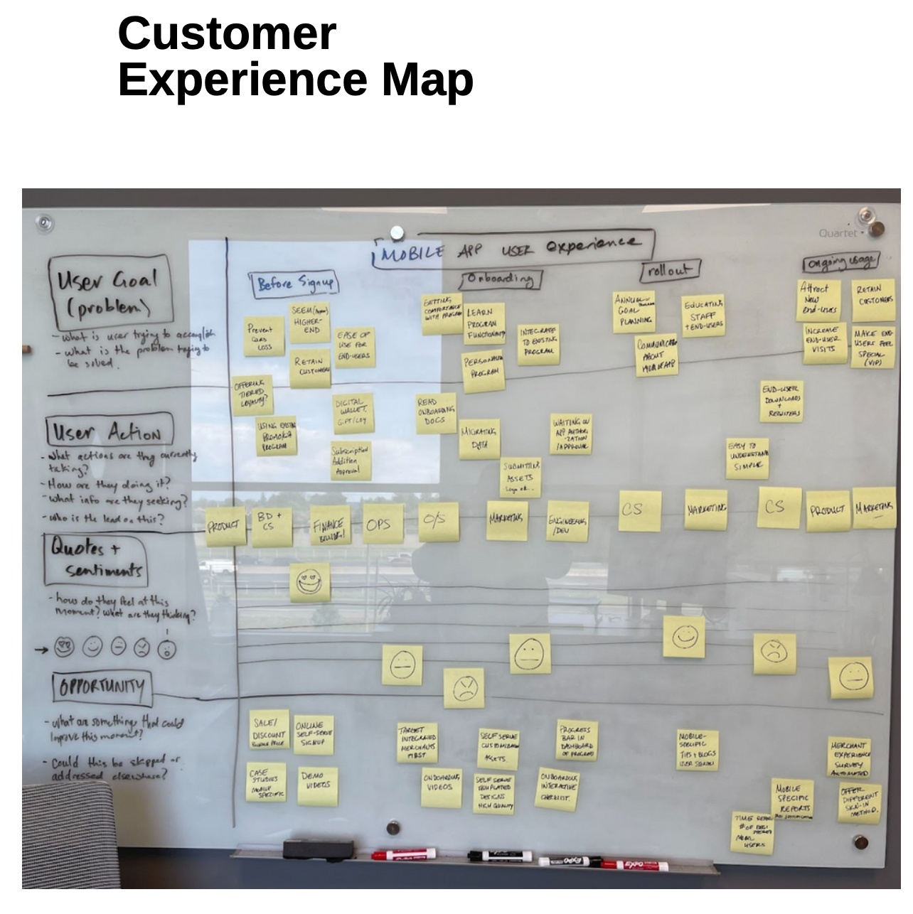
Customer Experience Map: mapping user goals, actions, and sentiment through the full lifecycle
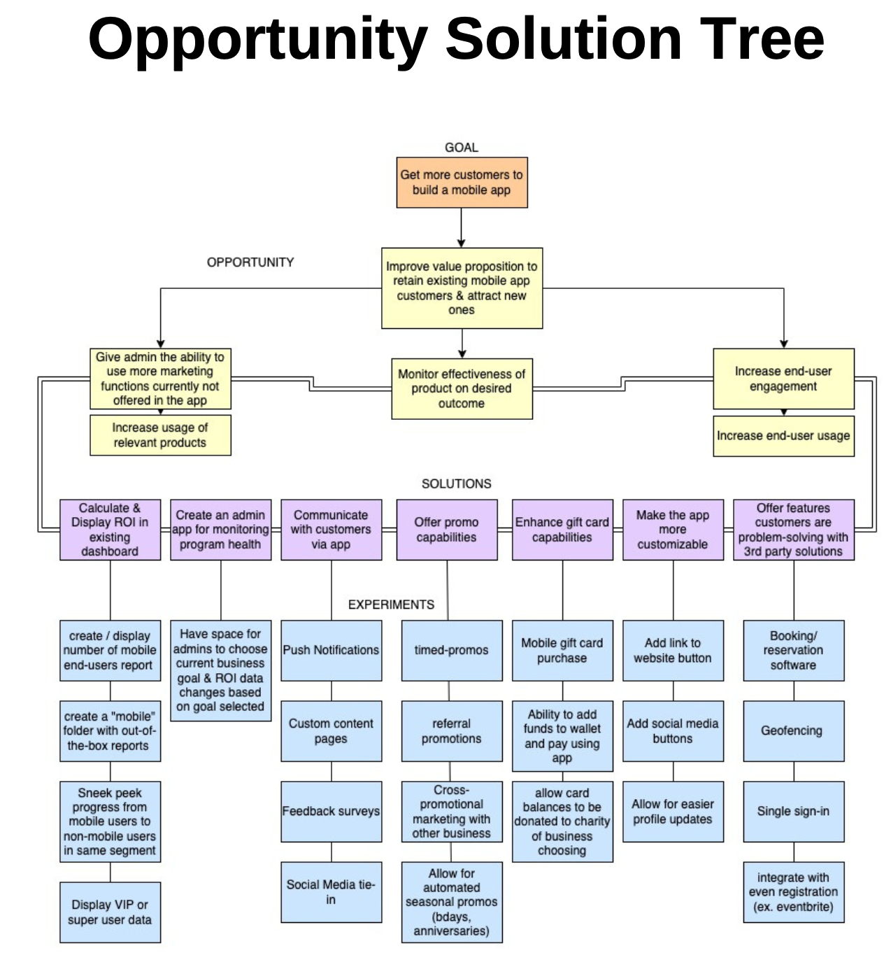
Opportunity Solution Tree: one goal, four opportunities, one chosen experiment
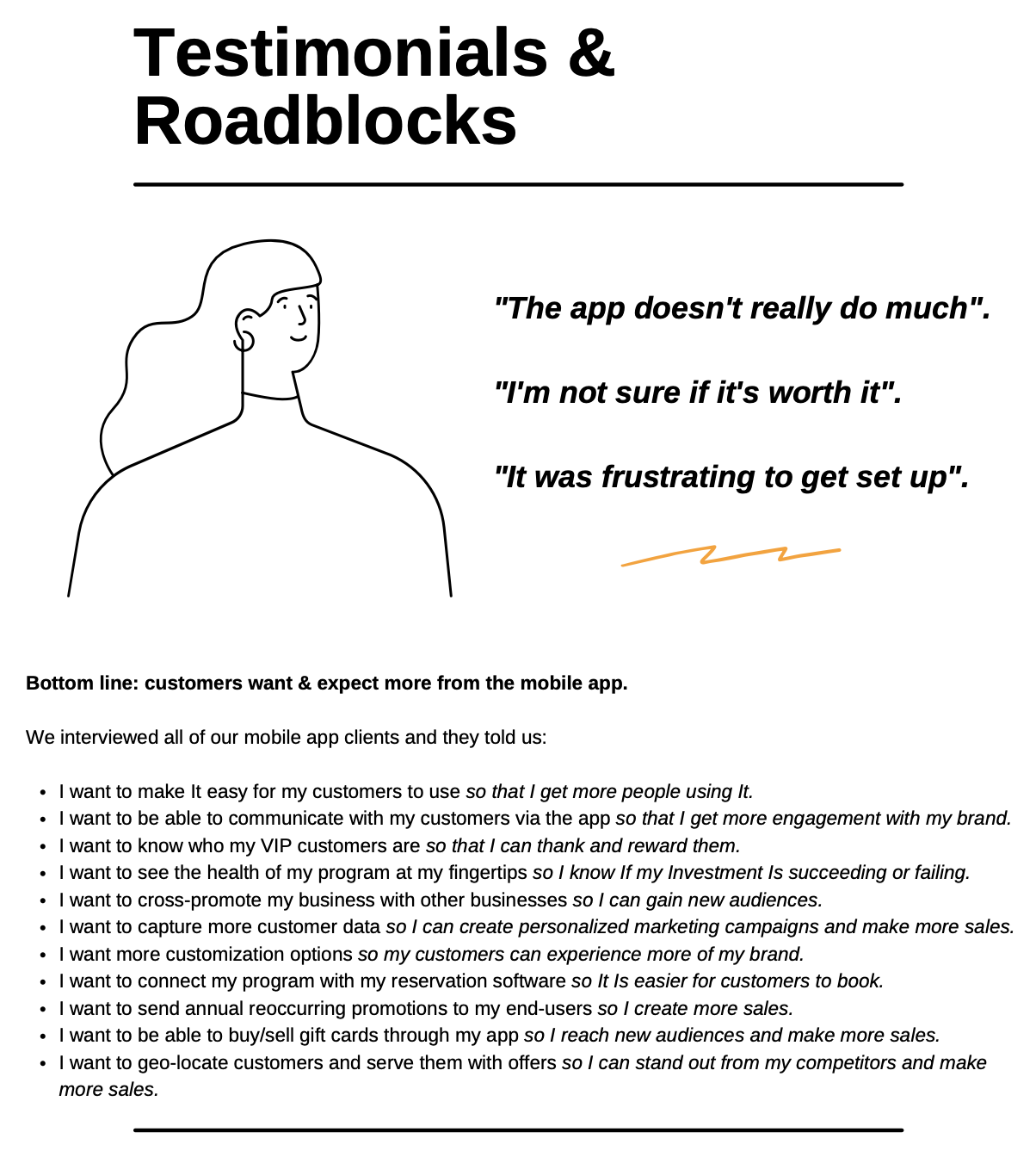
Testimonials & Roadblocks: direct client feedback shaping the opportunity space
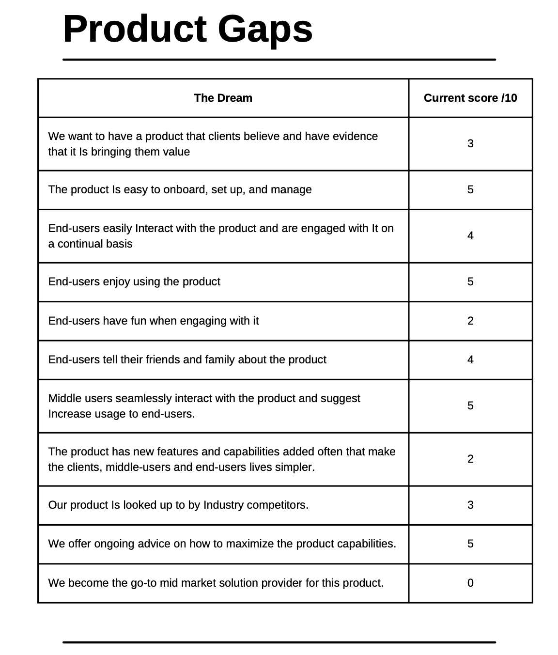
Product Gaps: scoring the gap between the vision and where the product stood
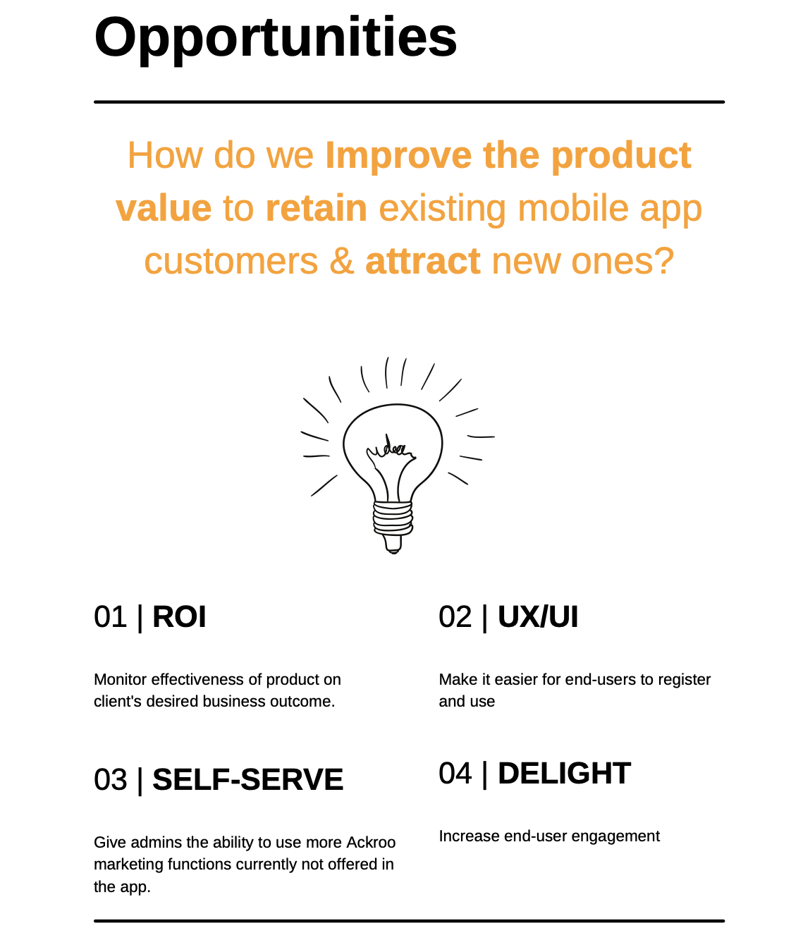
Opportunities: the four levers considered before choosing where to focus
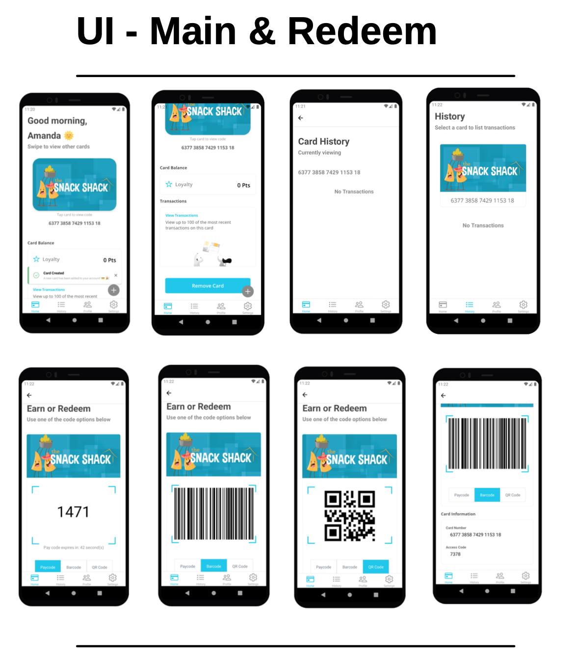
UI: Main & Redeem screens, showing the app experience end users actually touched
How I shape for the rider.
Experience design: a board is judged in the water, not on the rack. If a flow needs a tooltip to explain itself, the flow is wrong.
Designing the intake flow
Self Check-In's entire premise rests on a single intake moment: someone tells us how they're feeling and what they want instead, and from that we build a real, curated itinerary. That moment had two jobs to do at once, in real tension. Emotionally, it had to feel like being asked by a thoughtful friend, not filling out an intake form, especially since burnout and overwhelm were exactly the state most people would be in when they opened it. Functionally, every answer needed to generate real structured data: enough signal to place someone into a specific emotional profile group that determined the actual itinerary they'd receive. I worked through the actual question wording with Claude until each one did both jobs at once, without needing a tooltip or instruction to explain itself.
Video walkthrough: first few questions of the intake flow
| Question | What it feels like to answer | What it's actually capturing |
|---|---|---|
| Week Context | A casual check-in: "don't overthink it," permission to just pick one | A macro stress/energy signal that calibrates the pacing of everything after it |
| Why Today | Validates whatever brought them there, including good reasons like celebration, not just crisis | Motivation type (reset vs. connection vs. celebration) which shapes the tone of the itinerary itself |
| Body State | Reframes from "how you think you should feel" to how your body actually feels | The core emotional-state input driving profile classification |
| Desired Feeling | Framed as picking whatever "feels most like relief," not a goal to hit | The target emotional outcome the itinerary is designed to deliver |
| Social Battery | No judgment either way: solitude and connection are both treated as valid | Determines whether the itinerary includes any social or interactive stops |
| Constraints | One open, gentle question instead of a battery of accessibility/dietary/budget fields | Safety and feasibility filters folded into a single low-pressure ask |
| Location Mapping | Framed as "what sounds right for this one," not "select your radius" | Determines the geographic scope the itinerary gets built around |
The questions that don't appear in that table matter just as much: the flow only asks 2b (what are you celebrating) if someone actually chose "I'm celebrating something," and only asks which part of Hamilton if they chose to keep things close. Nobody answers a question that doesn't apply to them, which is a big part of why the flow doesn't need explaining as you move through it. It's already reacting to what you told it. Contact information (name, email, phone) comes dead last, after someone has already emotionally invested in the questions, rather than gating the experience behind a signup wall up front. And the logistics that do need to be stated plainly (the specific days and hours we run, the 48-hour lead time) are said once, exactly where they're needed, instead of living in a separate FAQ someone would have to go looking for.
The Location Mapping question wasn't part of the original flow. It came from watching real users hit friction after launch. Some were frustrated at being routed across town because they hate traffic; others were disappointed we hadn't sent them somewhere new. That split told me it wasn't really a logistics question, it was a personality signal, so I added it as an explicit choice instead of guessing. Users have also flagged a real limitation: intake happens at booking, but the actual experience can be three to four weeks later, so the emotional state someone reports isn't necessarily the one they'll be in on the day. That's a legitimate gap, and it's also a good example of holding scope: the fix (resending intake closer to the actual experience date) is a real idea for a future version, not this one, because the priority right now is getting a clean, solid read on how version one performs before adding more moving parts.
One more deliberate choice sits underneath all of this: the intake questions only appear after someone has paid, not before. I went back and forth on the logistics of that for a while, but landed on it for a specific reason: the questions themselves, combined with the profile-building logic on the back end, are close to the actual secret sauce of the product. Showing them to anyone browsing before they've bought in would let people reverse-engineer how the personalization works without ever paying for it. Asking for that information after commitment, not before, protects the mechanism the entire product depends on. If a question ever needed a tooltip to make sense, that was the signal to rewrite the question, not add the tooltip.
Why style is substance.
Brand, voice, and UI polish aren't garnish; they're part of how the product actually functions.
The disclaimer that had to sound like us
Every page that touches booking or intake carries a short line making clear Self Check-In isn't a mental health service, with a link out to real support for anyone who needs more than a curated day can give. It wasn't my idea originally. It came out of a conversation with Claude about the responsibility of building something for people carrying burnout, but once it was in front of me I didn't want it to read like legal boilerplate. It needed to sound like the rest of the brand: warm, plain, a little literary. Copy like this is easy to bolt on as an afterthought. I wanted it to feel like it was written by the same person who wrote everything else on the page.
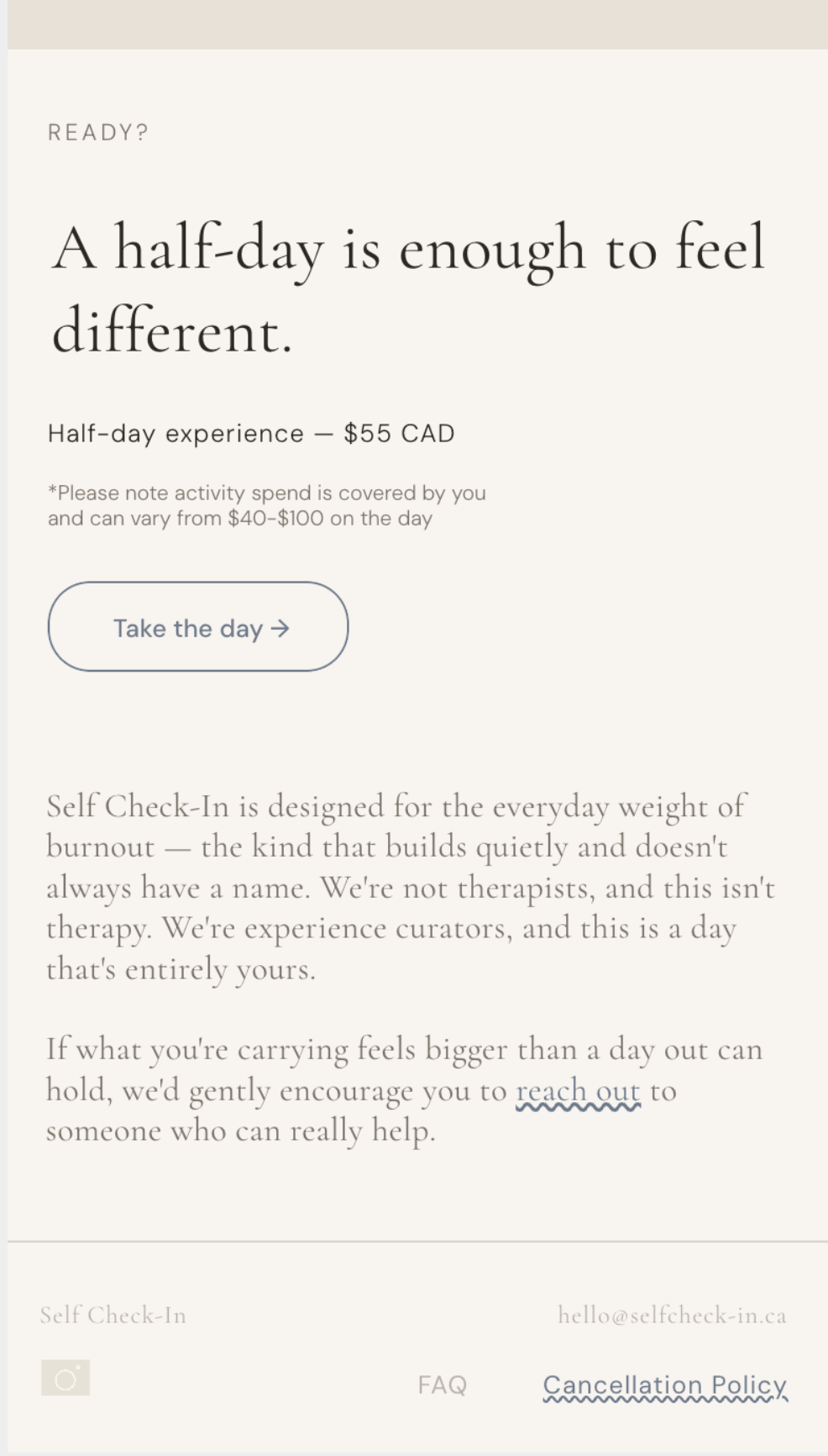
Pricing page: the disclaimer sits quietly in the footer, never competing with the testimonial or the CTA above it
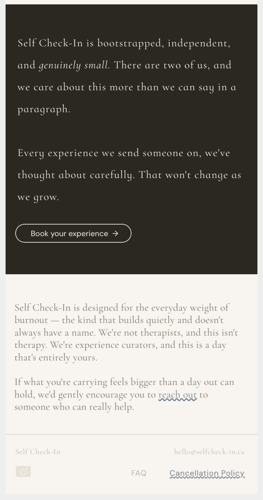
The same plain, honest voice shows up outside the disclaimer too: "genuinely small" instead of the usual founder-story polish
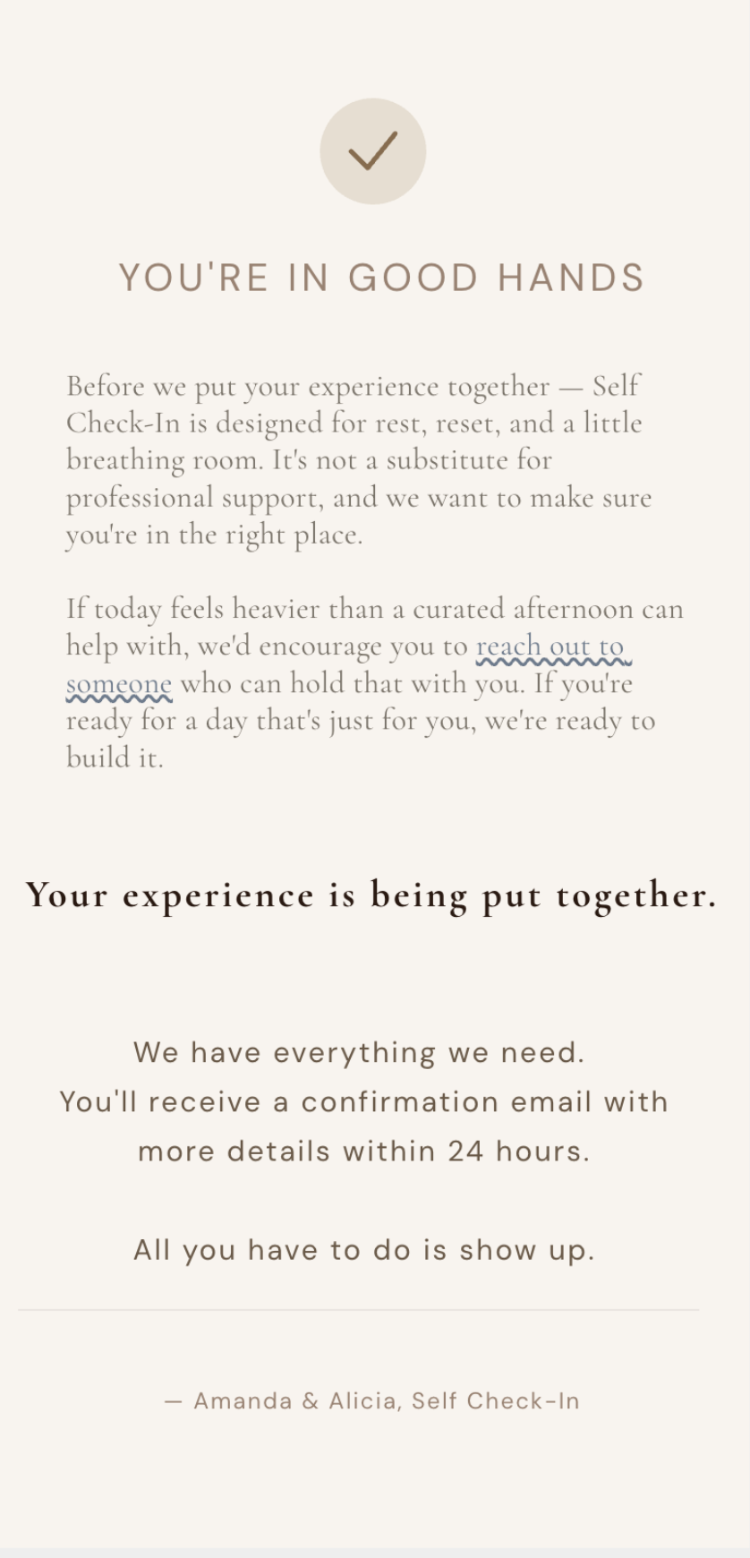
Post-intake confirmation: the disclaimer appears again here, right before someone's information gets used, not just once and forgotten
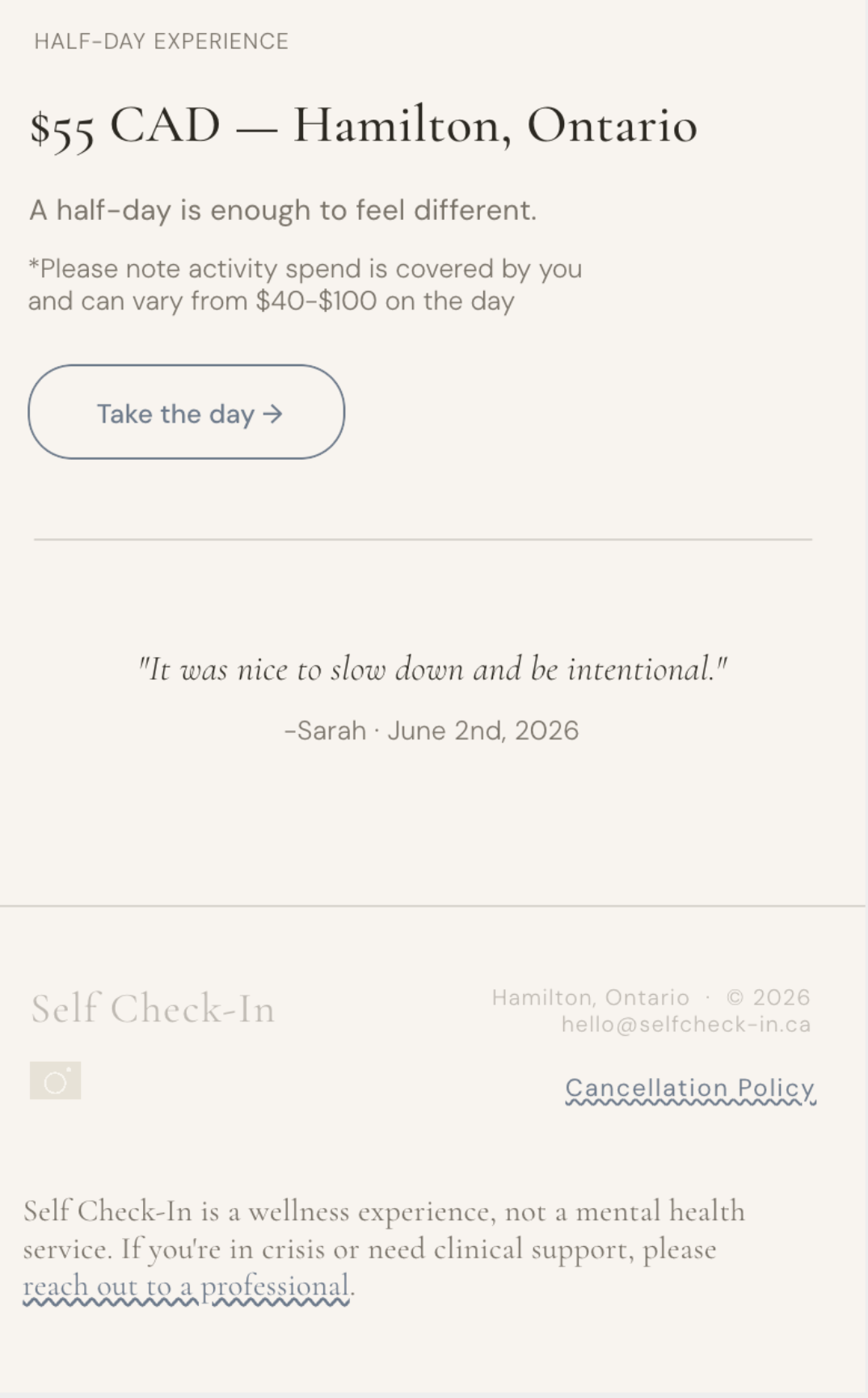
Closing footer: same line, same tone, every time it appears
I kept the disclaimer short and repeated it everywhere it was actually relevant (pricing, post-intake, the footer) rather than writing it once and burying it on a policies page nobody reads. Linking it to a real crisis resource, not just a vague "seek help" line, was the non-negotiable part. Everything else about it (the phrasing, where it sits, how much visual weight it gets) got the same attention as any other line of copy on the site, because a disclaimer that reads like it was pasted in from a template undermines the exact trust the rest of the brand is built on.
How I paddle back out.
Shipping from scratch means wiping out in public. This is the part where I show the recovery, not just the highlight reel.
From manual messaging to automated dispatch
Self Check-In's testing phase ran entirely on manual SMS. I sat at my computer for the full length of every experience (sometimes hours) watching for a reply so I could send the next message by hand, timed to wherever the person actually was in their day. It worked when I was running one person at a time. It stopped working the moment I wasn't.
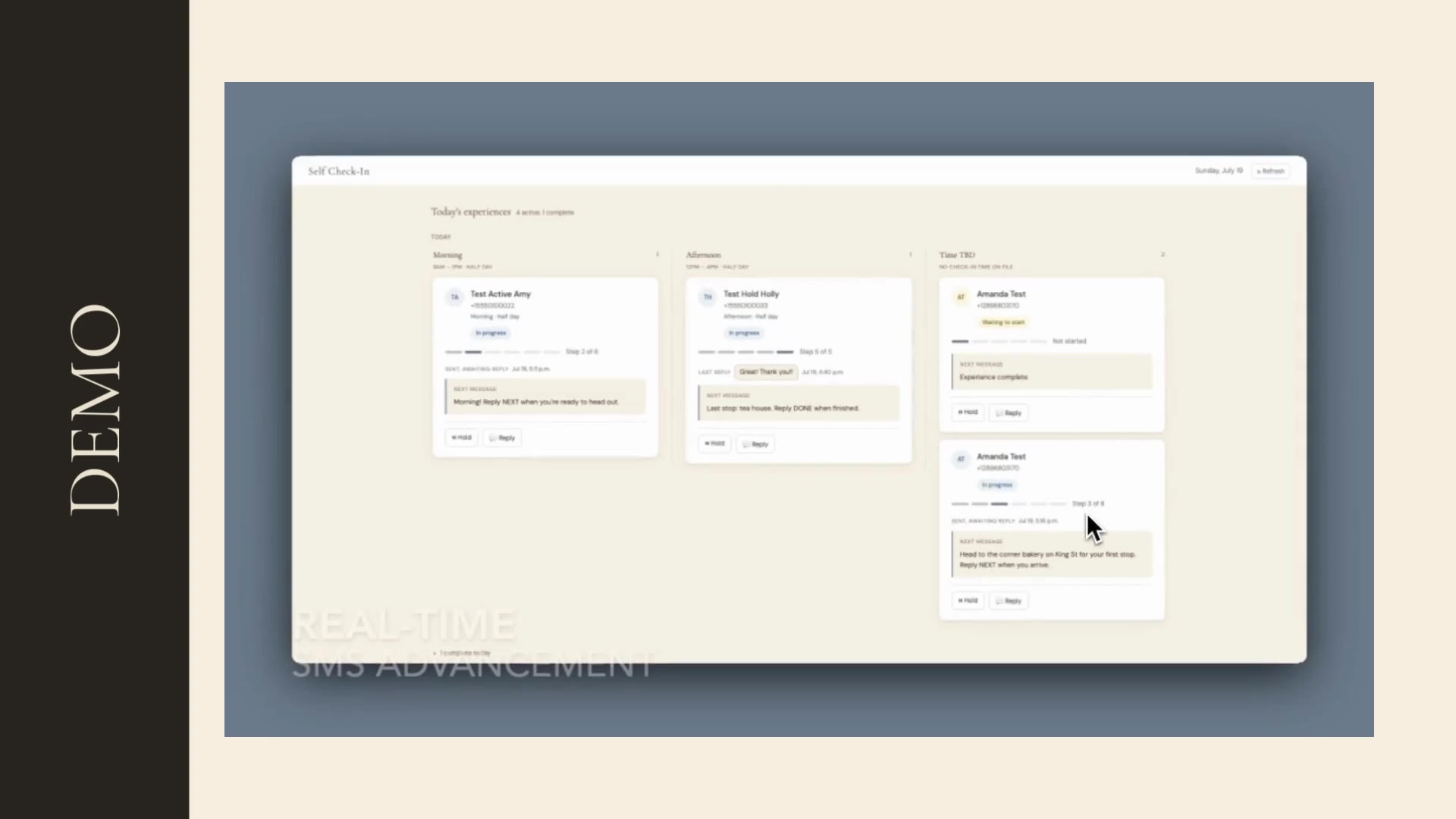
The dispatch site I built: every active experience visible in real time, with Hold/Reply controls instead of me babysitting a phone
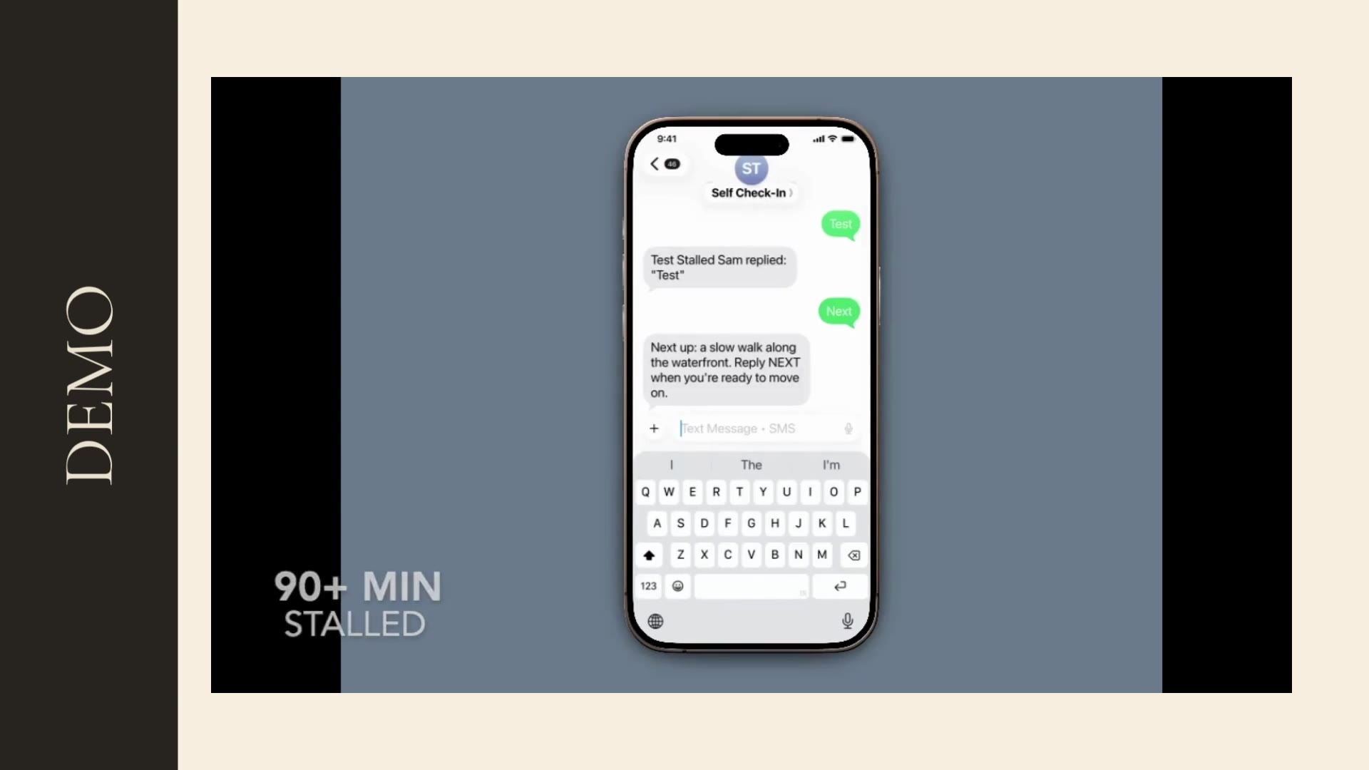
The exact failure mode automation fixed: a conversation gone quiet, with no reliable way to know if a message had landed
What automating this actually bought me, beyond just getting my evenings back
The wipeout was slow, not sudden. Twilio changed its developer portal mid-build, and it started hanging and freezing on me: the logs wouldn't update in real time, so I'd send someone their next message and then have no way to know whether it had actually gone through. That's a bad feeling on its own; it's worse when the thing on the other end is a real person mid-experience, waiting on you. And the setup only worked for one person at a time: the front end wasn't built for concurrency, so running two experiences at once meant real risk of sending the wrong message to the wrong person. None of that was sustainable, and testing more than one person at a time (which I needed to do) made it actively worse.
I automated the SMS delivery ahead of schedule, earlier than I'd planned to take that on, because the manual version was costing me more than the build would. It took real time to get right. Once it was live, it did more than remove the babysitting: I built a proper dispatch site on top of it, so I can see every active experience at a glance, with stalled conversations flagged automatically instead of me guessing from a silent log. And because the same infrastructure was already in place, I shipped a second thing I hadn't originally planned for this stage: automated feedback collection and referral prompts once an experience wraps, so every completed experience now feeds the next one instead of just ending.
Surfing what's in front of me.
Small teams, small budgets: you don't get to order the conditions. You build with what's actually in front of you.
Building it without an engineering team
I'm not a developer, and Self Check-In didn't have the budget to hire one before I knew whether the core idea was worth building at all. The conventional path (raise or save enough to bring on an engineer, spec the product, wait for a build) wasn't available to me, and honestly wasn't the right board to paddle out on anyway. So I used Claude as my technical build partner: writing and debugging the SMS flow, working through the intake question logic with me, later building the automated dispatch system that replaced my manual texting. None of that would have shipped this fast, or this cheap, waiting on a hiring process.
| Hire a dev team first | What I actually did | |
|---|---|---|
| Team | 1–2 developers hired before writing any product code | No developers: built and shipped solo, with Claude as the technical partner |
| Cost before first real user | Tens of thousands in salary or contractor fees, spent before validating anything | $0 in engineering spend |
| Time to first real test | Months: hiring, onboarding, and spec-writing before a developer even starts | Weeks: straight from idea to a working SMS flow with a real person on the other end |
| Iteration speed | Bottlenecked by developer availability and sprint planning | Same-day: question wording, message timing, flow logic, changed directly |
| Risk | Lower technical risk, but real financial risk if the idea doesn't land | Real technical debt and no second set of eyes on the code, but zero financial risk from an unproven idea |
This wasn't a workaround I'm apologizing for. It was a deliberate bet. Waiting to fund an engineering team before testing whether an emotionally-guided itinerary could actually make someone feel different would have meant months of delay and real money spent before knowing if anyone wanted this at all. Working directly with Claude let me write, debug, and ship the actual mechanics of the product myself (the SMS flow, the profile-building logic behind intake, the dispatch automation) without a sprint cycle or a team to loop in first.
I'm honest with myself about the trade-off. I'm not a professional developer, so there's real technical debt sitting in that codebase, and I don't have a second set of eyes catching the blind spots an actual engineering team would catch. But the goal at this stage was never to build enterprise infrastructure: it was to find out, fast and cheaply, whether the core idea worked. Given the conditions I actually had, that was the right board to be on.